Plank
UI/UX DESIGN
WEB DEVELOPMENT
Plank is a Cape Town–based production company crafting commercials for local and international brands. Their work sits at the intersection of cinematic storytelling and commercial precision — and has earned them long-standing relationships with agencies and brands who value craft over volume.
The brief was clear: Plank’s new digital presence needed to match the calibre of work they were producing, not lag behind it. For a production company being considered by international brands and agencies, the site is often the first impression after the reel — and that first impression had to carry the same weight as the work itself. Before any design work could begin, two underlying problems had to be solved:
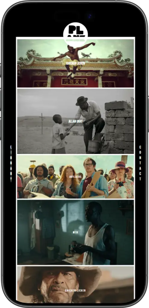
The site had to disappear behind the work No bloated navigation, no dense copy, no distractions. Just a frame for the reels.
It had to be easy to maintain in-house A CMS Plank could actually use, so new reels could go live the day they were delivered.
We proposed a single guiding idea: the site should behave like a television.
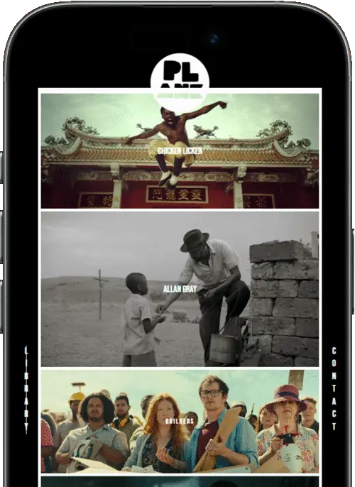
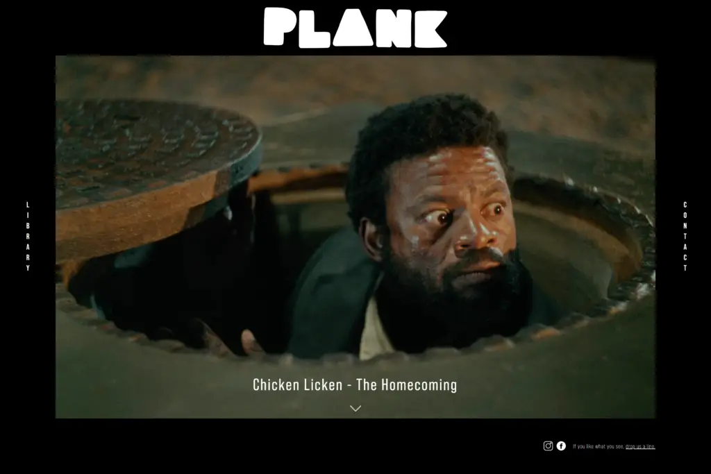
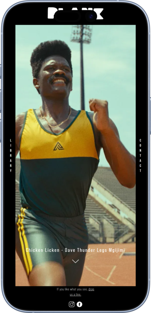
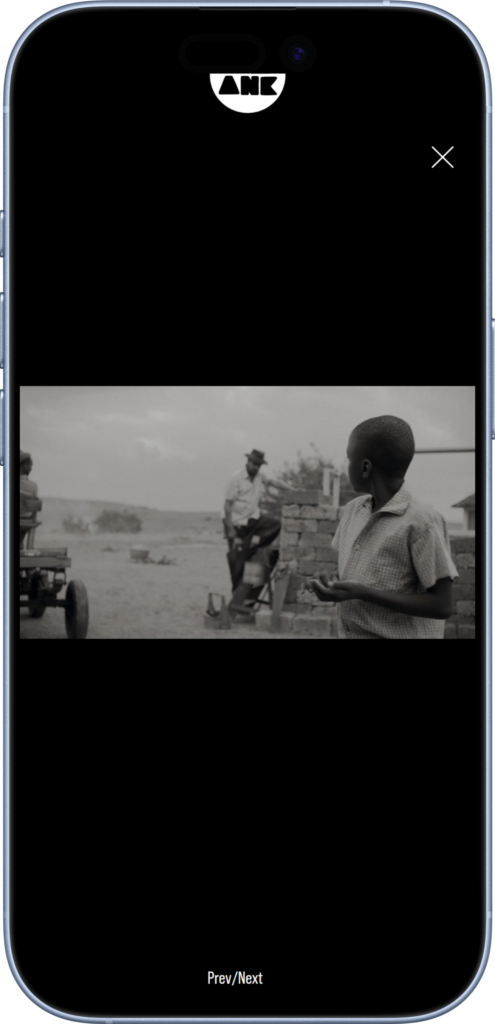
Every page would frame the work the way a TV frames a broadcast — a black border, a perfectly fitted viewport, and the work itself sitting at the centre of attention. Nothing competing. Nothing distracting. The site as a screen, the reels as the broadcast.
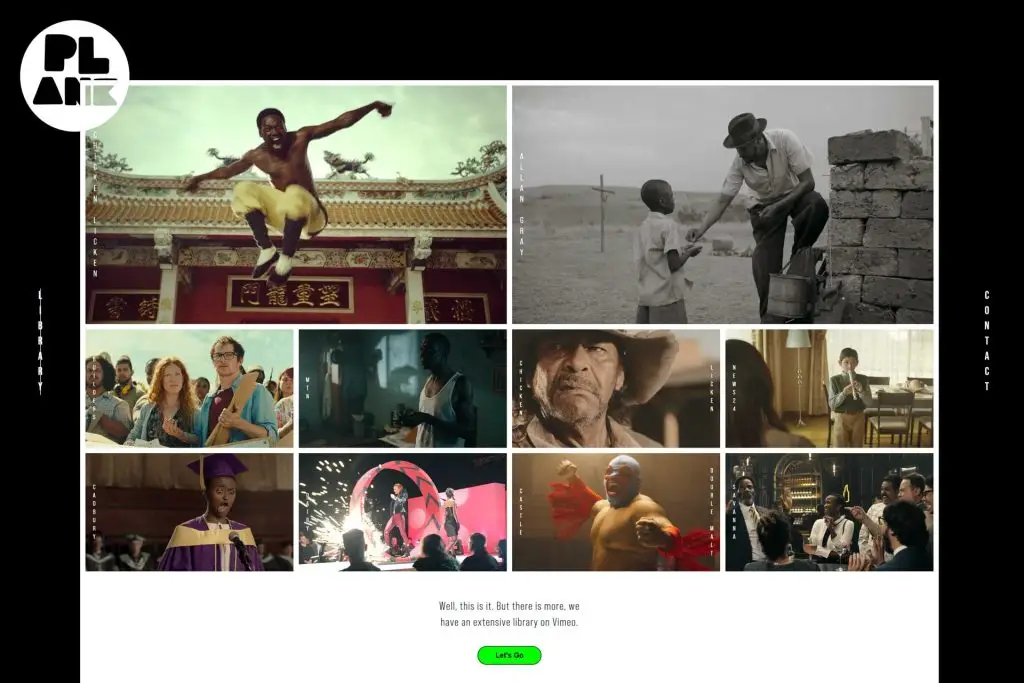
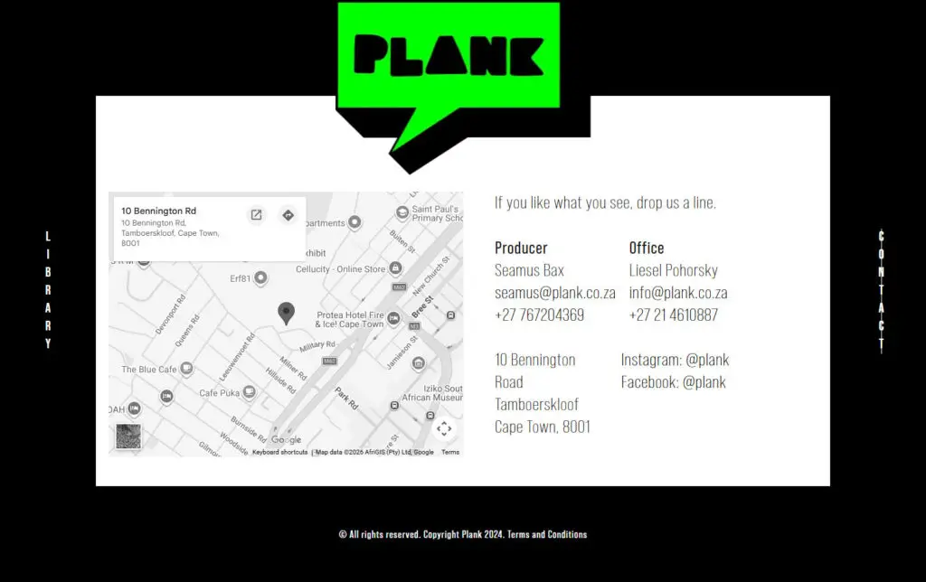
This idea drove every decision that followed — including the architecture itself. The site is three pages: Home, Portfolio, and Contact. That’s it. No about page padded with bios. No services page listing capabilities. No blog. Plank’s commercials are designed to do the talking — so we built a site that gets out of their way and lets them.
Hard, uncompromising palette Black and white with a touch of green. The restraint isn’t a stylistic choice — it’s the entire point.
One typeface Bebas Neue throughout. Tall, condensed, cinematic — the kind of type you’d see on a film title card or a production company’s slate. Pairing it with itself across the whole site reinforces the restraint: one voice, one tone, one visual rhythm.
Stripping a site back to its essentials makes every remaining decision louder. With almost no copy, no marketing furniture, no decorative flourishes — the design had to do all the work the words usually do. Every choice that survived the edit had to justify itself.
A concept is only as good as its execution. The “television” idea could have stayed an abstract pitch — a nice line in a presentation. What makes it work is that every interaction on the site behaves the way a television would.
No page builders, no template foundations. PHP, HTML, CSS, JavaScript — built from scratch for total control over precision, motion, and performance.
Reels are delivered via Vimeo for reliable, high-quality playback without the load penalty of self-hosting. The work plays at the quality it deserves, every time.
The WordPress back end was structured so the team can add a new reel in minutes — upload, paste, publish. No developer required, no design decisions to second-guess. The site grows with the studio.
A deliberate outcome of building lean rather than building fast. For a production company whose work demands attention, every second of delay is a second of attention lost.
Plank were thrilled with the result. The new site reflects who they are now — a production company confident enough in their work to let it speak for itself.