A Case Study

OZblu

UI/UX DESIGN
WEB DEVELOPMENT

OZblu is the blueberry brand of United Exports — a global grower and exporter supplying fresh blueberries to retailers and consumers fifty-two weeks a year. Known for their proprietary varieties, their record-breaking fruit, and a genuine commitment to social impact, OZblu needed a digital home as ambitious as the operation behind it.

The Challenge

The real challenge on this project wasn’t technology — though the old site had plenty of that, weighed down by a stack of unnecessary plugins. It was the brief itself: the new site had to serve three very different audiences at once, without diluting any of them.

Consumers wanting to know the berry People who’d tasted an OZblu and wanted to know where to buy more, how they’re grown, and what makes them different.

Trade buyers assessing a supplier Retailers and importers who needed to see compliance, food safety credentials, and the scale of a serious global operation.

Stakeholders looking at impact An audience focused on OZblu’s ESG work — sustainability, worker welfare, and the OZblu Academy.

The Approach

We proposed a single guiding idea: the site should give every visitor a clear path, without ever making them feel like they’re on someone else’s.

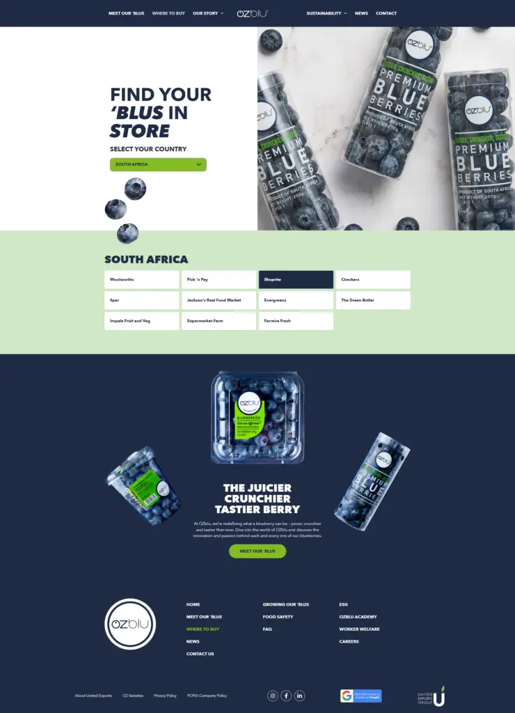
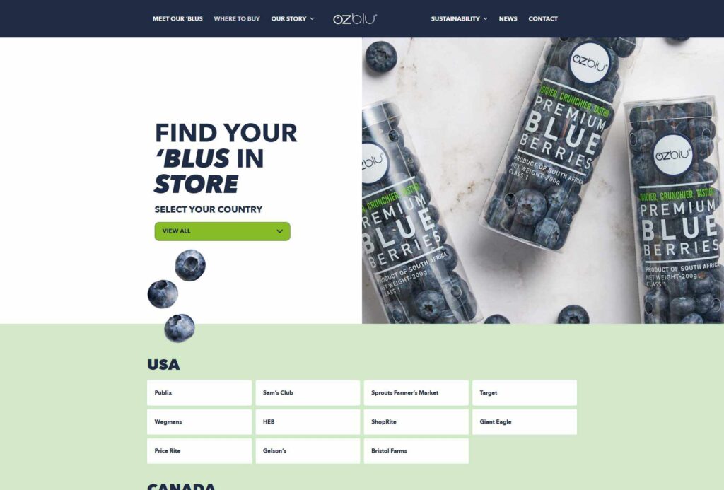
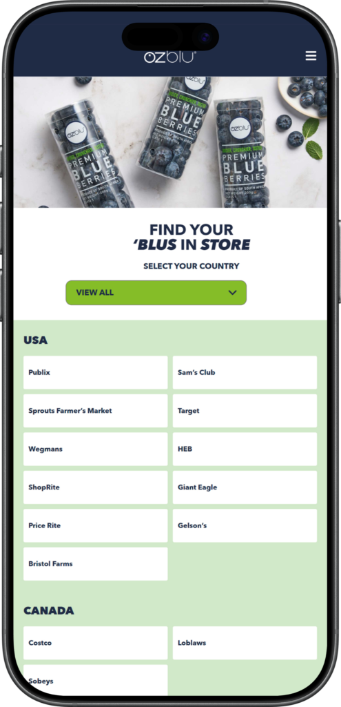
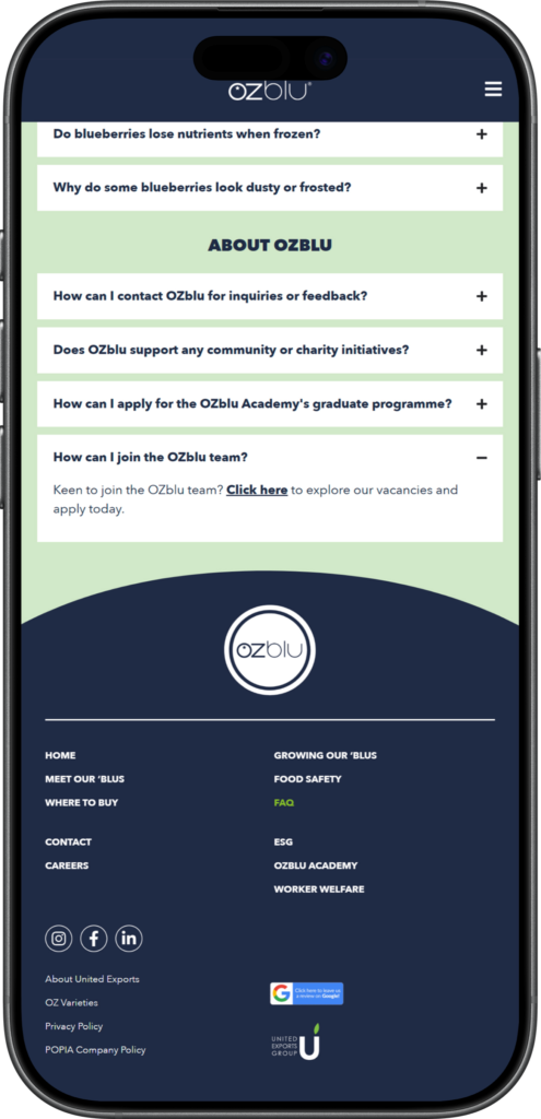
Rather than building three sites bolted together, we built one architecture generous enough to hold all three journeys. A consumer can move from the homepage to “where to buy” without wading through compliance documentation. A trade buyer can find food safety credentials without scrolling past recipe content. A stakeholder can explore the OZblu Academy as its own complete story.

That idea drove every decision that followed.

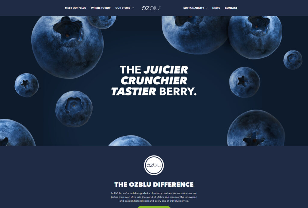
Deep blueberry blue, fresh leaf green, and a soft, ripe accen, set against generous white. The brand’s colours, tuned for clarity and contrast across a content-heavy site.

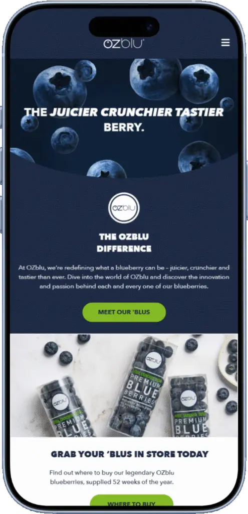
Avenir throughout, but pushed. Headlines run at a heavy 900 weight, sometimes italic, giving them a round, full, almost fruit-like form that echoes the berry. Body copy stays at a calm 400. The contrast gives every page energy without noise.

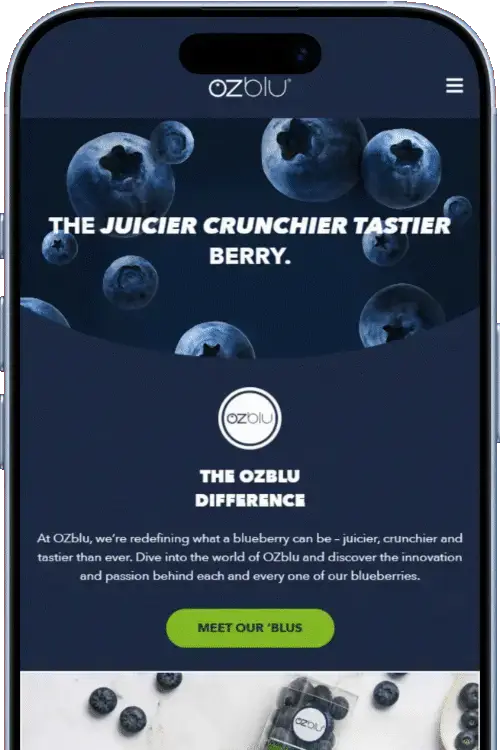
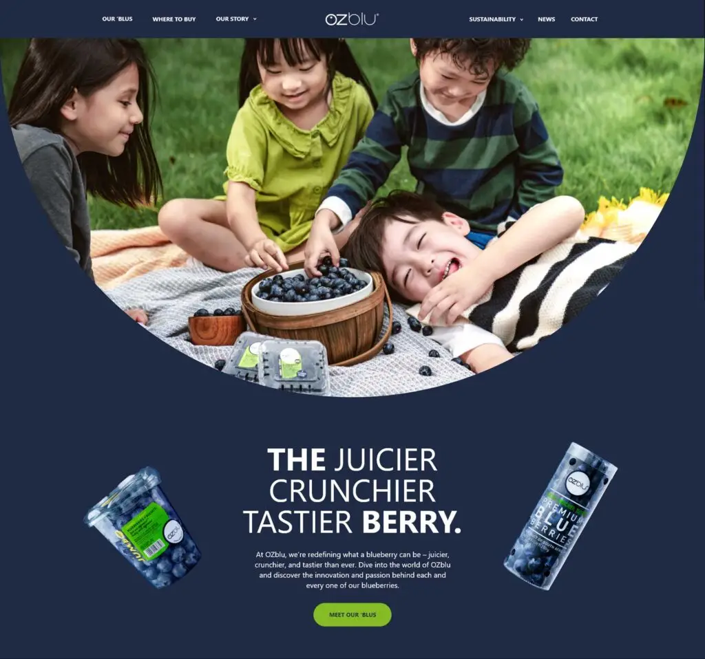
OZblu already had a brand with real personality — we refined its existing elements rather than replacing them, sharpening the system so it could carry a site of this scale. The goal was a design that felt as bold and appetising as the product itself, while still having the structure to handle dense, technical content.

A site serving three audiences across this much content only works if the underlying structure is genuinely sound. The craft on this project was in the architecture — making something broad feel effortless to navigate.

Built on Elementor, deliberately

OZblu specifically wanted Elementor as their page builder, so the team could make minor edits and updates in-house. We built the site to use it cleanly and efficiently.

A deliberate plugin diet

The old site’s biggest problem was plugin bloat. We stripped the stack back to only what was necessary — fewer dependencies, fewer points of failure, a faster and more stable site.

Structured for self-sufficiency

Beyond the page builder, the back end was organised so the team can add news articles, update “where to buy” information, and refresh content without technical help.

2 second load time

A direct result of clearing out the plugin bloat and building lean. For a content-rich site serving a global audience, fast loading isn’t a nice-to-have — it’s credibility.

The Outcome

OZblu now has a website that matches the scale and ambition of the business behind it — bold, fast, and genuinely useful to everyone who lands on it. Where the old site was a bottleneck, the new one is a tool the team can run themselves.

Hi. Tell us about your project. Or just say hello.