A Case Study

De Bergkant – Karoo Still

UI/UX DESIGN
WEB DEVELOPMENT

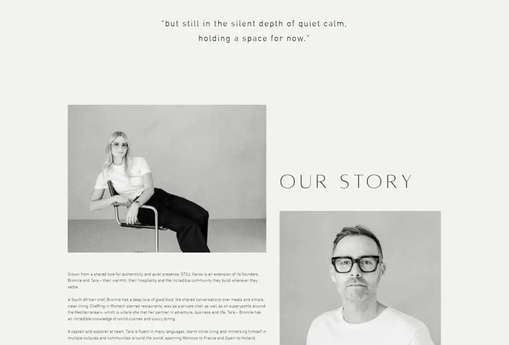
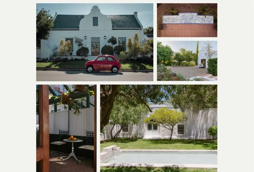
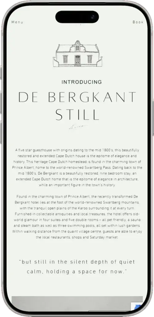
De Bergkant is a five-star guest house in Prince Albert — a beautifully restored Cape Dutch homestead dating to 1858, set at the foot of the Swartberg mountains. It’s the South African home of STILL Karoo, the hospitality collection founded by Bronnie and Tara, whose other properties span the Italian coast. Their work draws on years of Michelin-starred kitchens, superyachts, and an obsession with stillness, simplicity, and quiet hospitality.
The Challenge

When Bronnie and Tara took over De Bergkant, they spent considerable time and care renovating the property — restoring its heritage, refining its interiors, and reshaping it into something that could carry the STILL Karoo name properly. The website they inherited from the previous owners reflected none of that work. Before any new guest landed on the property, they would first land on a website that told a completely different story.

The site had to match the renovation, not just describe it The new De Bergkant had been designed with material care — antique finishes, natural light, considered restraint. The website needed the same hand.

It had to position De Bergkant as part of a collection STILL Karoo is one property in a small international group. The site needed to read with the same quiet confidence as a boutique hotel brand — not a standalone B&B.

The Approach

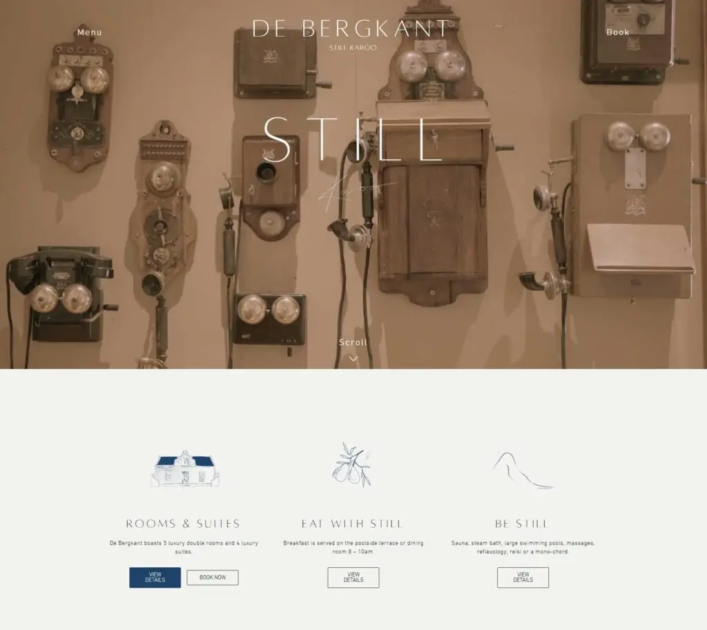
We proposed a single guiding idea: the site should feel like the guest house feels.

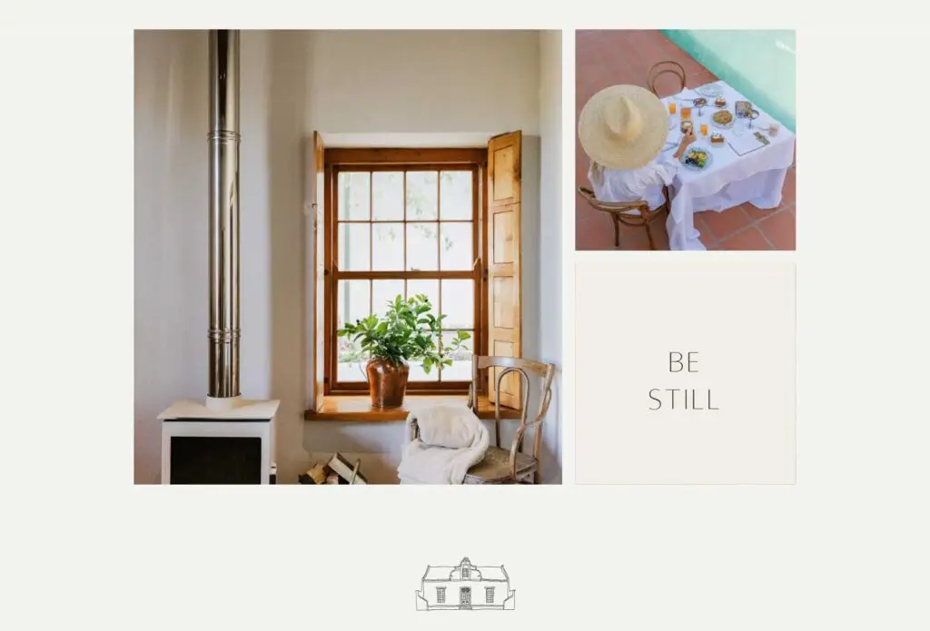
That meant translating the experience of arriving at De Bergkant — the slowness, the materiality, the considered absence of noise — into a digital surface. Not a brochure about the property. A continuation of it.

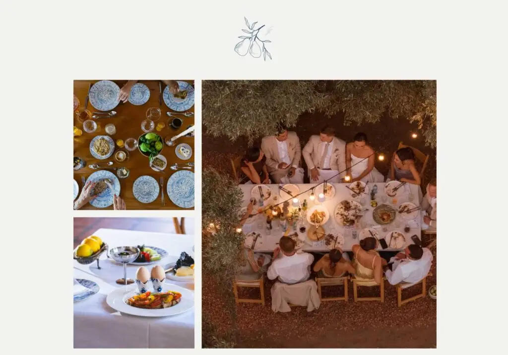
Most hospitality websites describe a place — they list amenities, count rooms, summarise activities. We wanted to invert that. Before anyone reads a word about De Bergkant, the site should already have communicated something true about how it feels to be there. The kind of guest the property attracts isn’t comparing tick-lists across booking platforms; they’re looking for somewhere that signals taste before it signals features.

That idea drove every decision that followed.

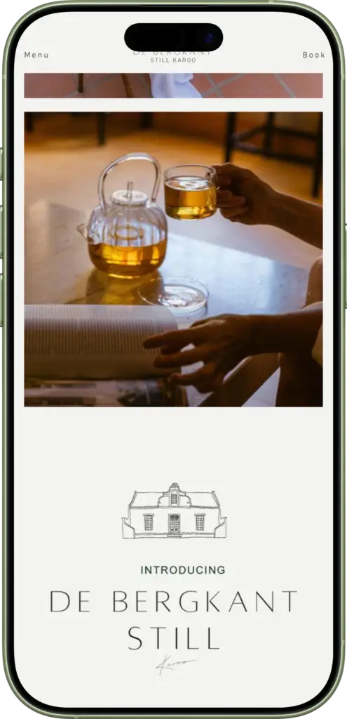
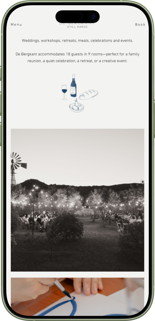
The brief asked us to match the renovation, which meant treating the website the same way Bronnie and Tara had treated the building itself: with restraint, taste, and attention to the details most people would never notice. Every margin, every photograph, every line of type had to earn its place.

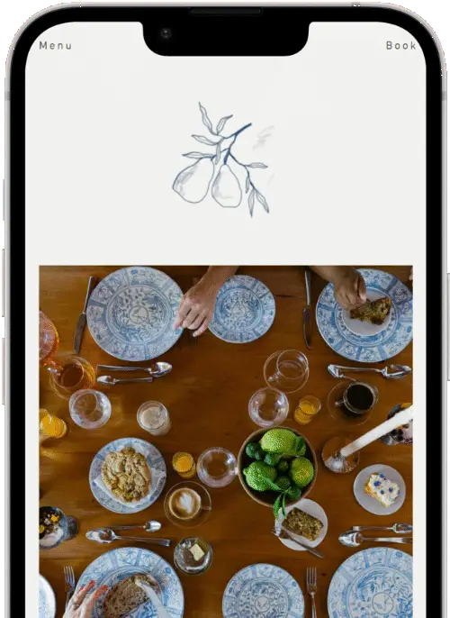
Warm sands against deep, grounded black and white. The colours of stone, plaster, and shadow — the same materials guests walk into when they arrive.

Alta for headlines — refined, slightly serifed, editorial in feel. Din for body — clean, modern, quietly authoritative.

Significant time was spent ensuring margins, padding, and spacing are consistent across every page and every breakpoint.

Editorial layouts only work when the underlying detail is right. A misaligned margin or an inconsistent padding throws the whole composition — and on a site that’s meant to feel as still as De Bergkant does, every visual hiccup is a small betrayal of the concept. The craft on this project was in what you don’t notice.

A site this image-heavy and detail-rich needed a build that could carry it without slowing it down. Bronnie and Tara also needed a back end they could manage themselves, with bookings handled cleanly through the system they already trust.

Custom WordPress build

Designed and developed end-to-end to support the editorial layout, the depth of content, and the volume of high-resolution imagery without sacrificing speed.

Integrated with RoomRaccoon

Bookings flow directly through to RoomRaccoon, the system Bronnie and Tara use to manage availability and reservations. Guests move from inspiration to confirmation without ever leaving the brand experience.

A CMS the team can actually use

The back end was structured so the team can update content, swap photography, or add a new room with ease. The site is built to grow alongside the property.

2 second load time

On a site loaded with hero photography, full-bleed imagery, and a video introduction, two seconds is a deliberate engineering outcome — not an accident.

The Outcome

The new De Bergkant website now sits in the same world as the renovated guest house itself — considered, quiet, materially confident. Where the old site told you about the property, the new one is part of the experience of staying there.

Hi. Tell us about your project. Or just say hello.